Why Lighthouses Are Painted in Stripes and Patterns: Daymarks Explained
Stripes are not decoration. On a coast where three towers stand within sight of one another, a spiral of black paint or a single red band can be the difference between a clean approach and a wrong turn toward a shoal. Long before a lighthouse shows its light, it has to introduce itself in daylight — and that introduction is what mariners call a daymark.
Look closely at a painted tower and you are reading a very old system of identification, one built from cheap materials: paint, geometry, and a fixed routine of repainting. Understand the logic and coastlines start to make more sense. You begin to notice why one tower is banded and its neighbour is plain, why the lantern roof is red, and why the flash you counted twice from the headland matches the number printed on the chart.
What Counts as a Daymark
A daymark is everything about a lighthouse that identifies it when the lamp is not the main clue: the colour scheme, the pattern of the bands, the shape of the tower, the colour of the lantern room, and often the buildings around it. Charts and light lists summarise all of this in a few compressed words — something like "white tower, two black bands, red lantern" — precisely so a navigator can match what they see against what the chart promises.
The term does double duty elsewhere in navigation. In buoyage, a daymark can mean the topmark on a buoy or a painted post on a breakwater. In lighthouse writing it usually refers to the tower's own daytime identity, and that is the sense worth keeping in your head when you read a sailing directions entry.
The Contrast Problem Every Painter Solves
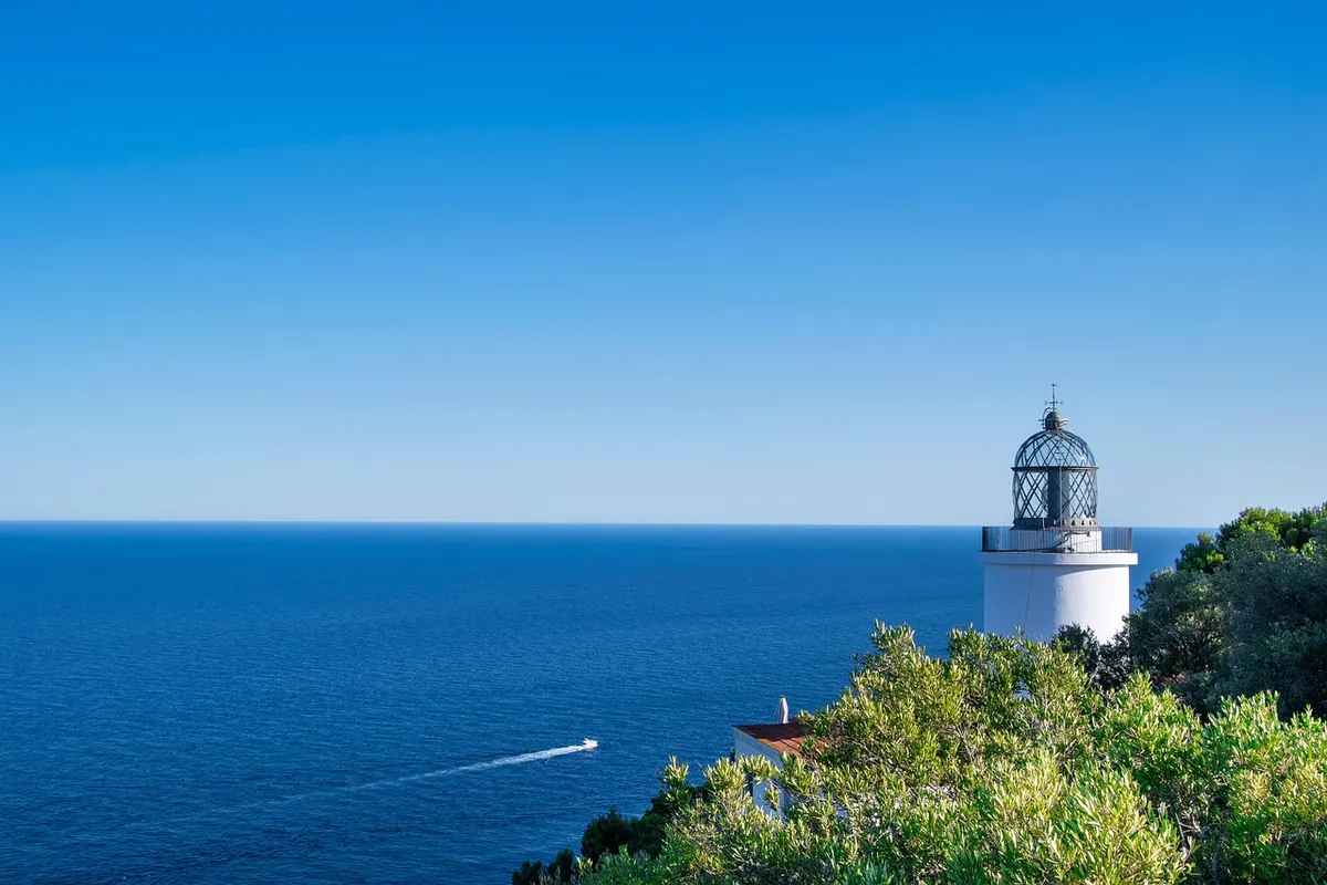
A plain white tower is beautiful and, against a bright overcast sky, almost invisible. Put the same tower in front of pale cliffs or a snow-covered shoreline and it vanishes again. A tower painted in broad black and white bands solves this by never being entirely invisible: whatever the background, at least one of the two colours will contrast with it. From seaward, the black bands read against the sky while the white bands read against dark land. Two chances instead of one.
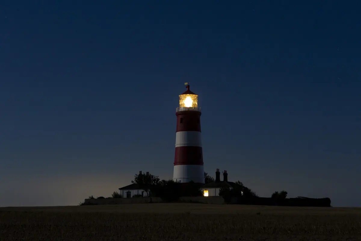
Red and white works on a similar principle with different conditions in mind. Red holds up in the low, warm light of early morning and late evening, and it stands out against grey rock, dark forest and white snow. White keeps the tower visible in poor light and in haze, where red turns muddy. Green and yellow appear on some stations, usually where local conditions or the need to differ from a neighbour demanded a third option.
Practical constraints shaped the results as much as optics did. Paint has to survive salt, sun and wind, and it has to be applied by people hanging in a bosun's chair or working from a scaffold. That favours big, simple geometry: a band you can lay out with a rope and a plumb line, a spiral you can mark in even turns, a chequer you can measure once and repeat. Elaborate artwork would be a maintenance nightmare, and it would blur into a smudge at three miles.
A Small Vocabulary of Patterns
Most lighthouse paint schemes come from a short list. Once you can name them, you can describe a tower to a companion, a logbook or a photographer without reaching for vague words like "stripey".
- Horizontal bands. Two or more broad bands, usually black and white. Easy to lay out, easy to read at distance. Bodie Island in North Carolina is a textbook example.
- Spiral bands. The barber-pole pattern, wound around a conical tower. Cape Hatteras is the most photographed version, and the spiral makes it unmistakable next to banded neighbours.
- Diagonal bands and chequers. Less common, used where a station needed to differ sharply from a nearby tower with horizontal bands.
- Single contrasting band or a colour cut-off. A tower that is white below and a solid colour above, or the reverse, so the change lands at a height the eye can judge.
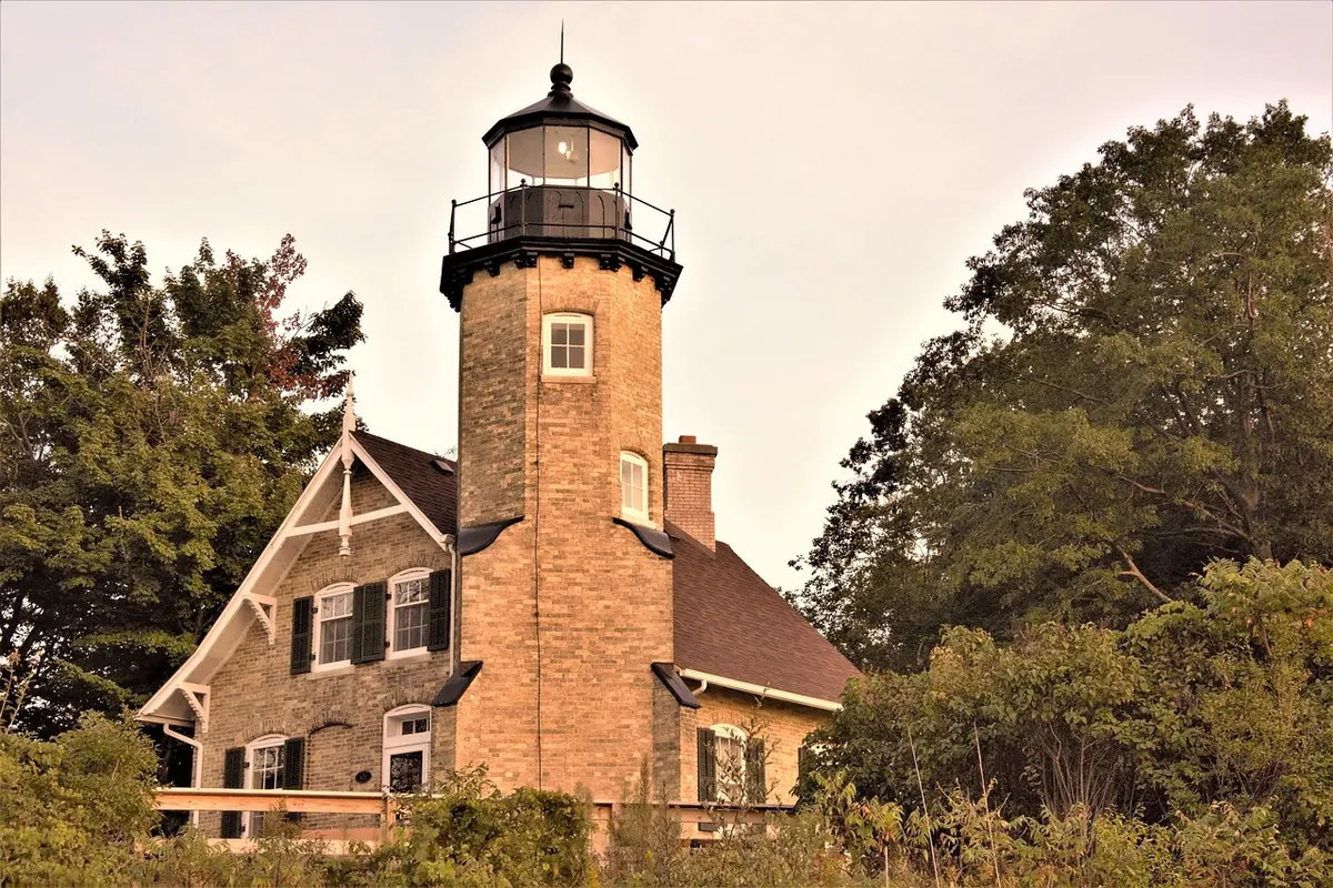
- Unpainted stone or brick. Granite and brick towers often keep their natural colour as the mark itself, with only the lantern and ironwork painted.
Two lighthouses within sight of each other must not share a scheme. This is the reason so many coastal pairs look deliberately mismatched: one banded, one plain, one spiral, one with a red lantern. The pattern is not regional taste. It is differentiation.
Colour, Shape, and the Rest of the Station
Pattern is only one layer. Tower shape carries information too: cylindrical, conical, octagonal, square, or the open steel lattice of a skeletal tower, which lets wind and spray pass through and was cheap to build where a masonry tower was not. In low sun, or in the flat grey of a misty afternoon, the silhouette may be all you get, and an experienced eye reads shape before colour.
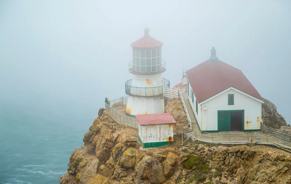
Then there are the details around the tower. A red lantern roof, a black gallery rail, a white keeper's house with green shutters, a fog signal building set to one side — these are part of the description on the chart and part of what you should be looking for. Stations that appear similar from a distance often separate cleanly when you check the outbuildings.
From Daylight to Darkness: Light Signatures
At dusk the daymark fades and a second identity takes over. Every lighted aid has a character — a signature — defined by the pattern of light and dark, its colour, and its timing. A light that flashes twice, waits, then flashes twice again is a different aid from one that flashes once in the same period, even if the towers stand a mile apart.
The notation on a chart looks cryptic but is compact. A white light showing two flashes every ten seconds appears as Fl(2) W 10s. Occulting means the light is on longer than it is off; isophase means equal light and dark; fixed means steady, sometimes with a brighter flash added. Letter codes for colour — W, R, G, Y — are added to the sequence.
Colour also draws boundaries. A sector of red or green light marks an arc where the safe water ends, so a red glow where you expected white is a warning, not a fault. Leading lights and range lights go further: two lights aligned, one above the other, put you on a known line into a harbour, and the moment they separate you have drifted off it.
The whole system is designed so that any signature is unambiguous for an observer in a given place. If two lights could be confused from the same position, one of them gets changed.
How to Read a Lighthouse, Day or Night
Identification is a habit rather than a talent. Try this sequence the next time you are on the water, or on a headland with a chart in hand.
- Read the chart or light list entry before you look up. Note the described pattern, tower shape, colours and lantern.
- Match the big shapes first: silhouette, bands, and where the colour changes on the tower.
- Check the lantern roof and the surrounding buildings. These settle the close cases.
- Time the flashes with a watch or phone. Count a full period twice; a single count can land you on the wrong station.
- Confirm the colour of each flash, and whether a red or green sector shows as you change bearing.
- Take a bearing. Two similar-looking lights are usually easy to separate once the compass tells you which is which.
A last tip for anyone photographing these towers: a daymark is designed to be read from the sea, so shoot it from a position where the pattern is side-lit rather than flat against the sky. The bands will hold their shape, and the tower will look the way the painter intended it to be seen.
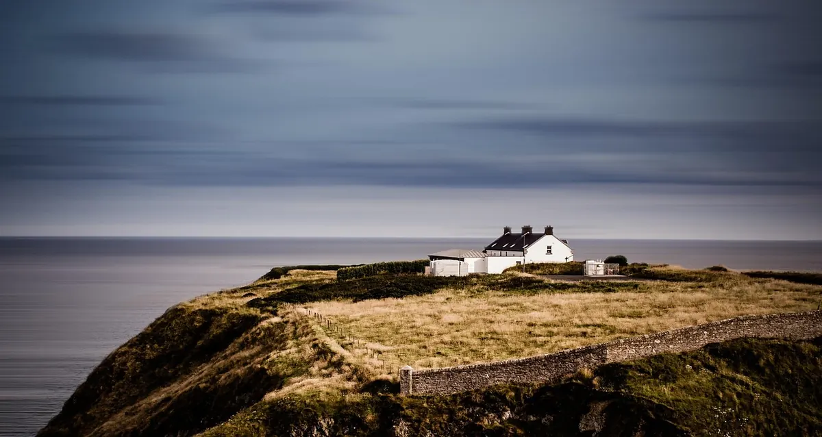
Photo: TheOtherKev / Pixabay
Lighthouse Stays vs. Nearby Hotels: How to Choose Overnight Accommodation
A practical comparison of lighthouse keeper cottages and nearby hotels on access, amenities, noise,...
Seven Curious Lighthouse Superstitions and Coastal Legends
A tour through lighthouse ghosts, sailor taboos and wreckers' tales — and a practical guide to telling a...
About Us